So, for this week’s module, we learnt about design principles that make for effective media. We got to play with WAVE, Canva, and Text-to-speech.
My Canva Experience and Poster
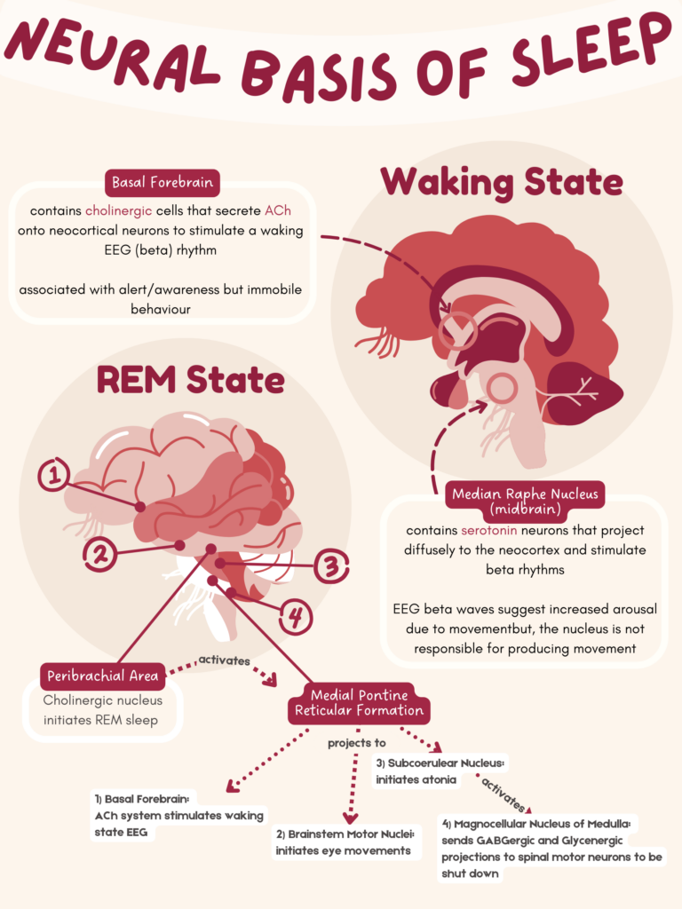
I want to firstly talk about the Canva poster I made. I decided to make a poster on a topic I learnt from PSYC351D (biopsychology) since I have always loved biology posters, and that was the most recent biology-related class I took. For the poster, I decided to make it on the unit of the neural basis of sleep, hence why the poster is called that. While I know there seems to be a lot of information on the poster, much of the material has actually been minimized.
For this poster, I wanted to implement contrast, hierarchy, and proximity.
- For contrast, I placed titles and important in this deep red colour, which would allow the words to pop against the beige-white background. For the more important areas of the brain, the word was placed on a red background, and the text was in white; this allowed for a higher contrast. Adding the circles behind the brains also allowed for better contrast between the two different kinds of sleep and allowed for better distinction between the two brains.
- For hierarchy, the labelling and the steps for rem sleep are shown in top-to-bottom order. This helps explain the REM sleep section since it would be easier to recall since the poster is labelled in that order.
- For proximity, all the information related to that kind of sleep was placed closer together. This allows for a better idea as to which information goes with which kind of sleep.
Initially, when creating this, I did try to use a template. However, I didn’t find a template that had all the elements that I wanted on my infographic so, I did end up spending a lot of time creating this infographic from almost scratch. Since this was my first time actually using Canva, using a template made it easier to know what I could and could not do. I initially did not know that I could curve text or add things behind other elements. Luckily, I actually use to create infographics but by hand. So, I would say I have had lots of experience creating these (and they were also all for biology haha). However, if I was new to this, I think using a template could really limit me and I might even get frustrated since I wouldn’t be able to find a “perfect template” that matched the one I wanted to create.

My Thoughts About Inclusivity and How to Make Things More Inclusive
I really enjoyed this unit since graphic design/UIUX is the line of work I would like to go into. I enjoy talks about accessibility — in fact, it is a topic of concern for one of my projects for my human-computer interaction class. I think something that could be useful for those with visual impairment would be a universal zoom function. Some sites don’t have a zoom; some have a zoom that does not work and some zoom makes the infographic weird. This does limit functionality for those who are visually impaired and by having a universal zoom, it allows for better functionality. Audio feedback is also really useful for an inclusive learning environment! Another feature that should be implemented would be for those who are colour blind. The idea I’m thinking about is like the ability to inverse colours on Apple devices. If theres an ability that changes the colours of say an infographic, that would increase it’s inclusivity.
My Thoughts on Text-to-Speech
Text-to-speech is a tool I don’t utilize often. I tried to use it during English class in junior high since I found reading a dread, but I ended up falling asleep (hahaha). Even with things like podcasts, I find myself not paying attention to the audio much. Granted, I normally listen to podcasts to fall asleep, but if a video is available, I’d rather play a video than just audio. For this unit, I played with text-to-speech, but I just can’t seem to focus. Whenever I’m listening to something like a podcast, it is more about filling the space with sound than really listening to something. I can focus in class and I can focus on music but, something about podcasts and speech-to-text makes it really hard for me to focus. Changing the voices didn’t make it much better for me, but it was a nice feature to have. I think those who have a preference for a kind of voice would really like that feature.
My Experience with Running WAVE
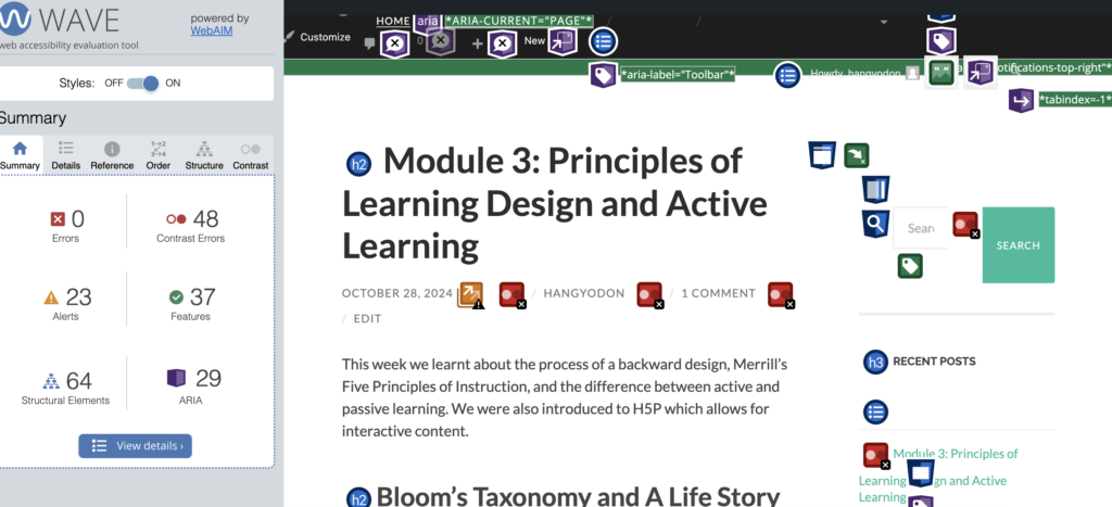
I ran WAVE on my blog, and I found it funny that the things that were bad were all things we couldn’t control. I think this information would be really useful for the developers of WordPress. I kind of expected a better grade from WAVE, but I’m glad most of the things that were of concern were not in my control (haha).

Link to my comments:
I love your strive to create more inclusive blog posts! When reading your post, I really thought about the first things we learned on our CSC journey specifically, the idea of edge cases. When coding, we want our code to account for any and every input. I like how you approached this similar idea to your blog. You want to account for everyone reading your blogs so, you’re striving to really include all those potential edge cases.
Your experience with Text to Speech couldnt have been more different than mine lol. Did you try different voices? I know you have a preference to more human like voices over robotic voices but, did you play with different genders or maybe ethnicities? I wonder if that would affect your focus.
The issues brought up when talking about WAVE was so relatable since I found those issues too! Maybe we can code something together to make a more inclusive website for this class lol.
Lastly, love your infographic! Looks so professional! I love the use of a slight yellow, definitely less strain on the eyes compared to a stark white and students reading your infographic would most likely need a slight break if theyre reading your infographic. Thanks for giving me ideas on effective study habits! I’ll be sure to test them out this exam season!
Hey Natasha, your blog post and infographic are super cool! The way you used contrast in the titles really makes the key info pop, and like the clear hierarchy helps guide the eye naturally from one section to the next. I also love your universal zoom idea as it’s such a thoughtful touch that would make a big difference for people with visual impairments. You’ve managed to blend effective design with accessibility, and it really shows in your work. Great job!
Hi Natasha,
I enjoy reading your blog. You have a great sense of humor, and I am smiling when reading it! First of all, great Canva poster. Normally, the topic of brain is a huge cognitive overload for me, but yours are not only simple to read, but there’s a sense of aesthetic to it!
Your discussion on universal zoom is super interesting! Do they even have a live caption function? I think that would be helpful. Usually I only saw caption on recorded ones.
I love how you said about your WAVE report. When I got my report, it was super confusing to me too because I cannot change what it recommended me to do. Also it says something about my YouTube video implementation, which they are not actual video, but hyperlinks. The thing I found about WAVE is that I do not think I agree with the report it gave me. I wonder if it is because my own bias and privilege of being an abled person prevent me to see whether or not my website is accessible.
Nat,
Im glad you had so much fun making your infographic! You can see the effort that went into it. Personally, I found the brain graphic with the REM State title overhead a big confusing from as there were so many things being pointed to – but I think that is more showing my lack of the required level of understanding of the topic to be able to glean information from it (idk if that made sense, I just mean I am not the intended audience). I found that it was information dense, but the arrows made everything flow linearly. The clarity of the infographic was also top notch! Im sure the intended audience would be able to effortlessly access all the information in there.
I was really shocked to hear about your experience using text to speech tools – I expected them to be a universal hit in terms of how they can make reading long academic passages feel like a breeze, but I think that just shows why there is a need for a plethora of accessibility tools in the first place – everyone is unique and different and absorbed information differently.
You insight on dark mode and zoom features being accessibility features helped me realize how much I love both of those features, and how the tools made for the few actually help the many. I can not go back to life using light mode – being flash banged in a dark room when you open your laptop is terrible enough, but then to go on a webpage and the background be white with black text – it needs to be the other way around and this should just be the baseline! I also know think I know what you mean about zoom not playing nice with infographics, if you zoom in on a webpage the text will increase but no the infographic – this is a consideration I will try and make in my own front end work.
Thanks for your lovely insights this week!